Building an effective business performance dashboard requires more than just connecting data sources to visualization tools. This comprehensive guide walks you through the essential steps to create a bulletproof dashboard system that consolidates data from multiple sources (Stripe, CRM, accounting systems, spreadsheets) into actionable insights. Learn how to define meaningful KPIs, establish a robust data infrastructure, and choose the right visualization platform to drive better business decisions.
Introduction
In today’s data-driven business environment, having access to real-time, accurate performance metrics isn’t a luxury—it’s a necessity. Yet many organizations struggle with fragmented data scattered across multiple platforms: revenue data in Stripe, customer information in their CRM, financial metrics in accounting software, and operational data trapped in spreadsheets.
The solution isn’t simply plugging these sources into a dashboard tool and hoping for the best. A truly bulletproof business performance dashboard requires careful planning, proper data architecture, and strategic thinking about what metrics actually matter for your business.
Too many dashboards fail because they become “data graveyards”—collections of charts and numbers that look impressive but don’t drive action or improve decision-making. The difference between a successful dashboard and a failed one lies in the foundation: clearly defined objectives, well-structured data, and thoughtful design.
This guide will take you through the proven methodology for building a dashboard system that not only looks good but actually transforms how your organization makes decisions.
Step 1: Define Your Business Objectives and Success Metrics
Before touching any data or tools, you must answer a fundamental question: What business problems are you trying to solve?
→ Identify Key Business Questions
Start by documenting the critical questions your dashboard needs to answer:
- How is our revenue trending month-over-month and year-over-year?
- Which customer segments are most profitable?
- What’s our customer acquisition cost and lifetime value?
- How efficient are our marketing channels?
- What’s our cash flow situation?
- Which products or services drive the most revenue?
→ Align with Stakeholder Needs
Different users need different information. Map out your dashboard audience:
| Stakeholder | Primary Needs | Key Metrics | Update Frequency | Detail Level |
| Executives | Strategic overview, high-level trends | Revenue, profit, growth rates | Monthly/Quarterly | High-level summary |
| Sales Teams | Pipeline health, performance tracking | Conversion rates, individual metrics | Daily/Weekly | Detailed breakdowns |
| Marketing | Campaign effectiveness, ROI | Lead quality, attribution, CAC | Daily/Weekly | Campaign-level detail |
| Operations | Efficiency monitoring, bottlenecks | Resource utilization, cycle times | Real-time/Daily | Process-level detail |
| Finance | Financial health, budget control | Cash flow, profitability, variance | Monthly | Transaction-level detail |
→ Define Success Criteria
Establish clear criteria for dashboard success:
- Specific decisions the dashboard should enable
- Frequency of use by different stakeholders
- Reduction in time spent gathering data manually
- Improvement in response time to business issues
Step 2: Identify and Define Your Key Performance Indicators (KPIs)
Not all metrics are created equal. The most effective dashboards focus on a carefully curated set of KPIs that directly relate to business outcomes.
The KPI Selection Framework
Use this framework to evaluate potential KPIs:
| Criteria | Questions to Ask | Good Example | Poor Example |
| Relevance | Does it directly impact business objectives? | Monthly Recurring Revenue | Number of website visits |
| Actionability | Can you take specific action based on this? | Customer Churn Rate | Industry benchmark data |
| Accuracy | Can you measure it reliably? | Stripe revenue data | Survey-based estimates |
| Timeliness | Is data available when needed? | Daily active users | Annual customer surveys |
Essential Business KPIs by Category
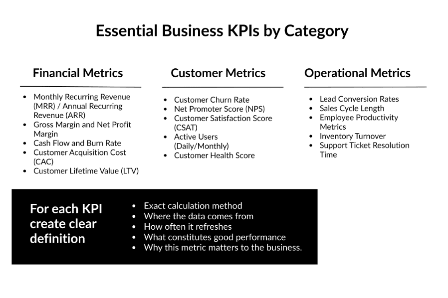
For example: Customer Acquisition Cost (CAC)
- Definition: Total marketing and sales expenses divided by number of new customers acquired in a period
- Data Sources: Marketing spend (advertising platforms, payroll), new customer count (CRM)
- Update Frequency: Monthly
- Target: <$500 for our business model
- Context: Measures efficiency of customer acquisition efforts; should be compared with LTV
Step 3: Audit and Map Your Data Sources
Understanding your current data landscape is crucial for building a reliable dashboard foundation.
→ Inventory All Data Sources
Create a comprehensive list of systems containing relevant data:
- Financial: Stripe, PayPal, QuickBooks, Xero, bank statements
- CRM: Salesforce, HubSpot, Pipedrive
- Marketing: Google Analytics, Facebook Ads, Google Ads, email platforms
- Operations: ERP systems, inventory management, HR systems
- Manual Data: Spreadsheets, documents, manual tracking
→ Assess Data Quality
For each source, evaluate:
- Completeness: Are there gaps in the data?
- Accuracy: How reliable is the data?
- Consistency: Are definitions consistent across sources?
- Timeliness: How current is the data?
- Accessibility: How easy is it to extract data?
→Document Data Relationships
Map how data connects across systems:
- Customer ID fields that link CRM to payment data
- Product codes that connect inventory to sales
- Date fields that enable time-series analysis
- Geographic identifiers for regional analysis
Step 4: Design Your Data Architecture
A bulletproof dashboard requires a solid data foundation. This means establishing a centralized system that can reliably collect, clean, and store data from all sources.
→Choose Your Data Warehouse Solution
Cloud-Based Options:
| Platform | Best For | Strengths | Limitations | Cost Range | Technical Expertise |
| Snowflake | Enterprise scale | Excellent performance, separates storage/compute | Higher cost | $$$$ | High |
| Google BigQuery | Google ecosystem | Cost-effective, good integration | Google-centric | $$ | Medium |
| Amazon Redshift | AWS users | Strong AWS integration | Complex management | $$$ | High |
| Azure Synapse | Microsoft stack | Office 365 integration | Microsoft-focused | $$$ | Medium |
→ Establish Data Pipeline Architecture
Design your data flow:
- Extraction: Automated data collection from source systems
- Transformation: Cleaning, standardizing, and enriching data
- Loading: Storing processed data in the warehouse
- Validation: Quality checks and error handling
→ Implement Data Governance
Establish rules and processes for:
- Data quality standards
- Update schedules and dependencies
- Access controls and security
- Backup and recovery procedures
- Documentation requirements
Step 5: Set Up Data Integration and ETL Processes
Extract, Transform, Load (ETL) processes are the backbone of your dashboard system.
→ Choose Your Integration Method
Direct API Connections:
- Real-time or near-real-time updates
- More complex to set up and maintain
- Best for critical, frequently changing data
Third-Party Integration Platforms:
- Fivetran: Extensive pre-built connectors, minimal maintenance
- Stitch: Good balance of features and cost
- Zapier: User-friendly for simple integrations
- Custom Solutions: Maximum flexibility, requires development resources
→ Design Your Data Models
Create organized data structures:
- Fact Tables: Store measurable events (sales, page views, support tickets)
- Dimension Tables: Store descriptive attributes (customers, products, time periods)
- Aggregation Tables: Pre-calculated summaries for faster dashboard performance
→ Implement Data Validation
Build checks for:
- Completeness (no missing critical fields)
- Accuracy (values within expected ranges)
- Consistency (matching totals across related tables)
- Timeliness (data freshness indicators)
Step 6: Select Your Dashboard and Visualization Platform
Choose a platform that matches your technical capabilities and business needs:
| Platform | Strengths | Best Use Case | Learning Curve | Cost | Integration |
| Power BI | Microsoft integration, cost-effective | Office 365 organizations | Easy | $$ | Excellent (MS) |
| Tableau | Superior visualizations | Data exploration & analytics | Medium | $$$$ | Good |
| Looker | Code-based development | Technical teams | Hard | $$$ | Excellent (GCP) |
| Sisense | Complex data handling | Multi-source analytics | Medium | $$$ | Good |
| Grafana | Real-time monitoring | Operational dashboards | Medium | $ | Good |
When evaluating dashboard platforms, consider the learning curve for your team, integration capabilities with your data warehouse, licensing costs and scalability requirements, mobile accessibility, collaboration features, and customization flexibility. These factors will determine which platform best fits your organization’s technical capabilities, budget constraints, and long-term strategic needs.
Step 7: Design Effective Dashboard Layouts
Great dashboards aren’t just about data—they’re about communication and usability. Use these dashboard design principles to ensure your report is actually brings the value:
| Principle | Description | Do This | Avoid This |
| Hierarchy | Most important info prominently displayed | Use size/color to emphasize key metrics | All metrics same visual weight |
| Simplicity | Clean, uncluttered design | Focus on essential information | Chart junk and decorations |
| Context | Provide meaningful comparisons | Show targets, trends, benchmarks | Isolated numbers without context |
| Actionability | Enable decision-making | Highlight exceptions and anomalies | Display-only information |
| Consistency | Uniform design language | Standard colors, fonts, layouts | Mixed visual styles |
Dashboard types serve different organizational needs: Executive Summary Dashboards focus on high-level KPIs and trends with minimal detail but maximum insight, typically updated monthly or quarterly for strategic oversight. Operational Dashboards provide real-time or daily metrics with detailed breakdowns and drill-downs in an action-oriented design for day-to-day management, while Analytical Dashboards emphasize historical trends and comparisons with interactive exploration capabilities to support ad-hoc analysis and deeper data investigation.
Step 8: Implement Testing and Quality Assurance
Before rolling out your dashboard, thorough testing ensures accuracy and reliability with pre-testing.
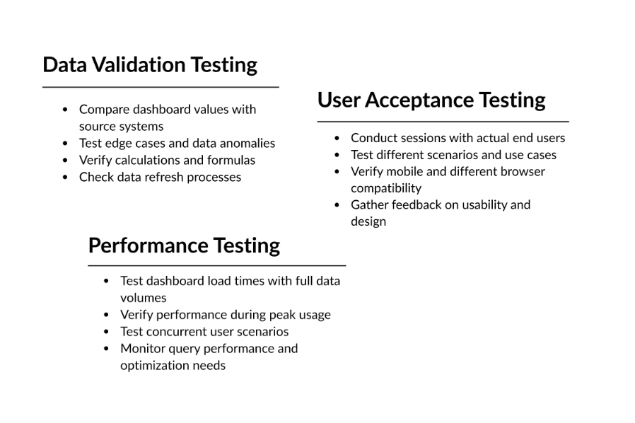
→ Best Practices for Bulletproof Dashboards
| Data Management Best Practices | ||
| Maintain Data Quality | Ensure Scalability | Security and Governance |
| Implement automated data quality checks Set up alerts for data anomalies Regular audits of data sources and processes Clear escalation procedures for data issues | Design for future data volume growth Plan for additional data sources Consider performance optimization from the start Document all processes and dependencies | Implement role-based access controls Regular security audits and updates Data privacy compliance (GDPR, CCPA) Backup and disaster recovery plans |
| Design and Usability Best Practices | ||
| Focus on User Experience | Performance Optimization | Change Management |
| Design for your primary users’ needs Provide training and documentation Gather regular feedback and iterate Keep dashboards updated and relevant | Use data aggregation for better performance Implement caching strategies Optimize queries and data models Monitor and address performance issues proactively | Communicate changes in advance Version control for dashboard iterations User training for new features Clear processes for requesting modifications |
→ Maintenance and Evolution
Regular Maintenance:
- Monthly data quality reviews
- Quarterly dashboard performance assessments
- Annual comprehensive system audits
- Continuous monitoring of data sources
Continuous Improvement:
- Regular user feedback collection
- Analysis of dashboard usage patterns
- A/B testing for dashboard improvements
- Stay current with new platform features
Summary
Building a bulletproof business performance dashboard is a strategic investment that requires careful planning and execution. The key to success lies not in the technology you choose, but in the foundation you build: clearly defined objectives, well-structured data, and thoughtful design focused on user needs.
Remember these critical success factors:
- Start with business objectives, not technology
- Invest time in proper data architecture and quality
- Choose KPIs that drive action, not just measurement
- Design for your users, not for impressive visuals
- Plan for maintenance and evolution from day one
The organizations that succeed with dashboards treat them as living systems that evolve with the business, not static reports that gather digital dust. By following this methodology, you’ll create a dashboard system that truly transforms how your organization makes decisions and drives results.
Your dashboard should become an indispensable part of your business operations—the single source of truth that everyone relies on for making informed decisions. When built correctly, it won’t just show you what happened; it will help you understand why it happened and what you should do next.
Don’t let another quarter pass with fragmented data and delayed insights. The businesses that thrive in today’s competitive environment are those that can make faster, better-informed decisions. Your bulletproof dashboard is the foundation for that competitive advantage.
Ready to get started? Contact us today to begin your dashboard transformation journey.