How can you visualize data so that it becomes clear, engaging, and useful?
The answer is well-designed visualization – one that not only presents numbers but, above all, tells a story and supports decision-making in the company.
If you want to better understand your customers, increase the efficiency of business processes, and react more quickly to market changes, read this article to the end – we’ve included everything you need to know.
👉 Here you’ll find a complete set of tips that will show you how to visualize data e.g. in Power BI and dashboards so that business reports in your organization work to your advantage.
What Are the Best Practices in Data Visualization?
To build a truly effective dashboard, you need to combine clarity with functionality. Below are several key principles that will help with data visualization and guide you on how to create a valuable report:
- Define the purpose of visualization
Every dashboard should answer specific business questions. Reports for the sales department will look very different from those prepared for the finance team.
- Simplicity above all (minimalism)
Too many charts and tables can be overwhelming. Focus on 3–5 key KPIs that matter most to your organization.
- Hierarchy of information and clarity
Make sure the most important data is visible right away – ideally at the top of the screen. Importantly, visual elements should not distract from the content. More detailed information can be placed lower down or made available after expansion.
- Consistency in colors and typography (subtle styling)
Use no more than 2–3 colors to highlight trends and anomalies. Additional elements can be emphasized with gradients or contrast. Don’t overdo it – too many colors and highlights will create chaos.
- Stylistic consistency
Each dashboard or report page should follow a consistent style – this makes the whole presentation look professional, cohesive, and easy to read.
- Optimization (responsiveness)
Ensure that the tool works across different devices – reports should be accessible and clear on computers, tablets, and smartphones.
- Company branding
An extra tip: in modern reports, it’s worth using branding – corporate colors, logo, fonts, or other design elements that build your company’s visual identity. This makes the dashboard look professional and aligned with your brand.
This is really important! Dashboards in alnalitical tools, e.g. Microsoft’s Power Bi, Google’s Looker Studio, Tableau , or Qlik allow users to filter data and move between detailed and general views. In other words, they are interactive – and this interactivity is one of the greatest advantages of modern tools.
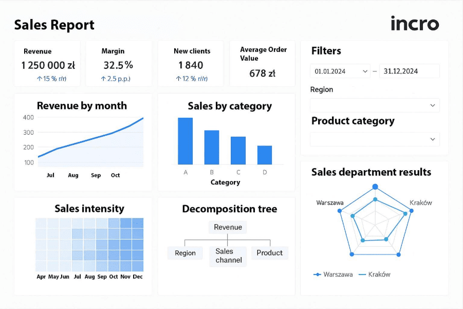
Below is an example of a sales dashboard in Power BI – showing how it might look in practice (illustrative image).
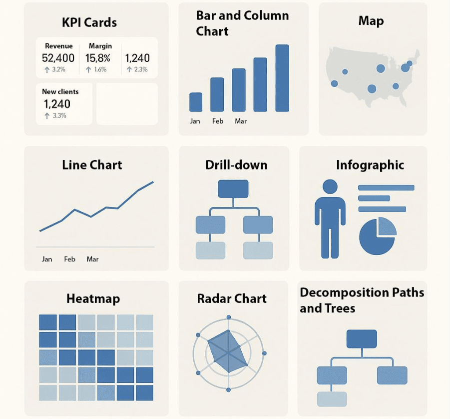
The Most Popular Visual Elements in Power BI
Power BI is a tool that offers tremendous possibilities for data visualization. The most commonly used elements, which you can also apply in your organization, include:
- KPI Cards – a quick summary of the most important metrics, such as revenue, margin, or the number of new customers.
- Bar and Column Charts – ideal for comparing categories and analyzing trends over time.
- Maps – visualization of geographic data, e.g., sales across different regions.
- Line Chart – great for tracking dynamics over time, e.g., sales growth month by month.
- Drill-down – a feature that allows you to move from general data to detailed analysis.
- Infographics – an attractive format that lets you quickly convey key information.
- Heatmaps (density maps) – show where values occur more frequently and where less often.
- Radar Charts – useful for comparing multiple variables simultaneously.
- Decomposition Paths and Trees – help analyze which factors affect KPIs.
- Histograms – display the frequency of occurrence of a phenomenon, e.g., the distribution of order values.
- Bubble Charts – allow you to analyze three dimensions of data on a single plane.
- Ribbon Charts – effectively present changes in percentage shares over time.
- Gauges (gauge charts) – visualize the degree of achievement of business goals.
Below are examples of visual elements.
How Can You Benefit from Data Visualization?
By implementing best practices in data visualization, your company will gain:
- Faster decision-making – clear reports make analysis easier and eliminate the need to go through hundreds of rows in spreadsheets, which means less manual work for you.
- Improved team efficiency – every department sees exactly the information that matters to them, which streamlines their work.
- Better internal communication – visualizations are understandable for analysts, managers, and executives alike; in other words, they are accessible to everyone.
- Easier identification of problems and opportunities – visualizations help uncover non-obvious trends that can lead to process optimization.
How Can We Help You Io Visualizing Data?
At Incro, we offer a comprehensive service in the field of working with data: we deliver solutions that allow you to move from manual, time-consuming reporting to fully automated dashboards in Power BI. What will you gain by working with us?
- Automated financial and operational dashboards
All key information – from financial results to operational KPIs – presented in one place.
- Expert support – CFO + analyst
At Incro, we don’t leave clients alone with the tool. Reports are created with the support of financial experts and data analysts.
- AI-powered chatbot for data analysis
A modern feature that enables interactive work with reports. Simply ask a question and get an answer directly from the data – no need to go through every chart manually. Check it on our YouTube channel.
- Solving typical reporting issues
Say goodbye to manual Excel reports, errors, and outdated data.
- Full transparency and historical data
With dashboards, you can quickly analyze current results and compare them with historical data.
Summary
The answer to the question of how to visualize data comes down to two things: the business goal and simplicity, clarity, and alignment with the user’s needs. Sometimes ‘less is more’! Dashboards in Power BI and reports prepared by incro can become a powerful tool to support the growth of your organization.
👉 If you want to learn how we can help your company effectively analyze and present data, get in touch with us – together we’ll build a solution that will enable you to make better decisions faster than ever before.